Dynamic toolbars that adapt to the current app while providing different levels of structure and support.
Join-In Pro uses adaptive toolbars to make apps and websites easier to navigate and more predictable to use.
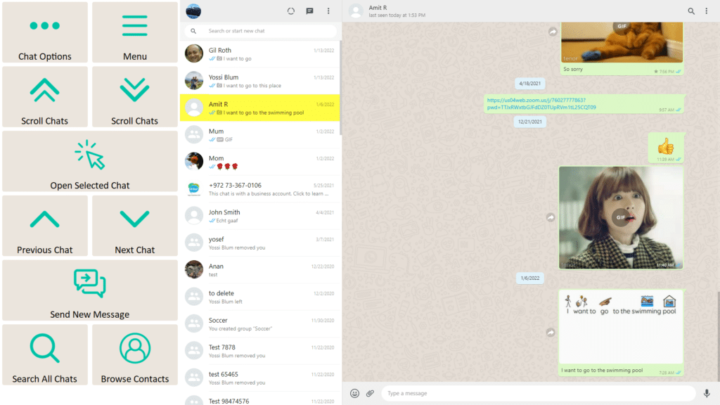
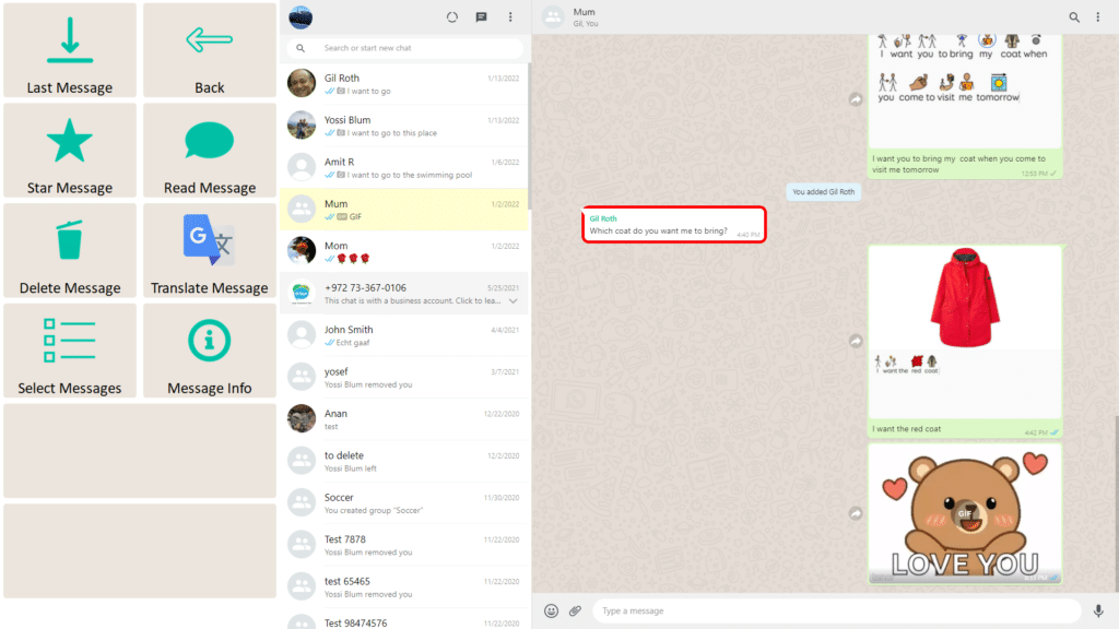
Rather than interacting directly with complex app interfaces, users work through a consistent toolbar that presents clear, meaningful actions. The toolbar automatically changes to match the current app, screen, and available content, while maintaining familiar interaction patterns across supported apps.
Join-In Pro includes three toolbar options — Full, Lite, and Basic — which provide different levels of structure and support. The toolbar can be changed at any time, allowing the interface to evolve as the user’s skills, confidence, and participation goals change.
Progressive Stages and flexible appearance settings provide additional ways to adapt the experience to each user’s needs and preferences.
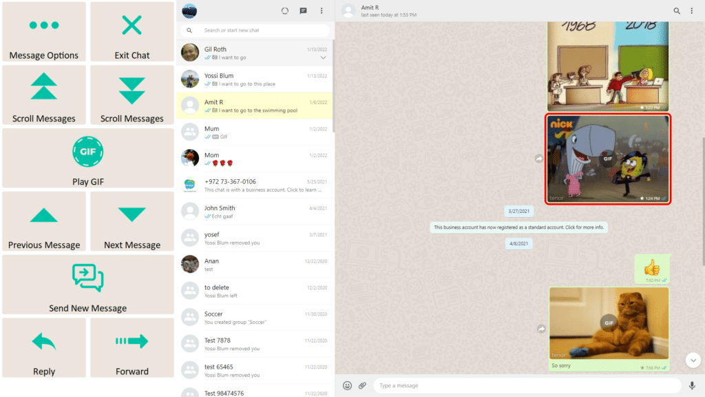
Join-In Pro toolbars automatically adapt to the current app, screen, and available content.
Only actions that are relevant at that moment are shown or enabled, while unavailable options are hidden or disabled. Join-In Pro also recognizes different types of content—such as photos, videos, documents, and web pages—and automatically presents the appropriate actions for each.
By presenting only the actions that are available when they are needed, dynamic toolbars reduce unnecessary complexity and make digital activities easier to navigate and understand.
At the same time, familiar toolbar layouts and interaction patterns are maintained across supported apps, helping users build confidence and transfer skills from one activity to another.
Every Join-In Pro app can be used with three standard toolbar layouts.
Each provides a different balance of simplicity, visibility, and available functions.
A complete range of functions
(5 rows x 2 columns)
Provides immediate access to the complete range of available functions with minimal internal navigation.
Best for:
Users who are comfortable managing more information on the screen and want the fastest access to available actions.
Larger controls with a familiar layout
(4 rows x 2 columns)
Keeps the same core functionality while using larger buttons and a simplified layout.
Some functions are accessed through additional menus, reducing visual complexity while maintaining access to the same activities.
Best for:
Users who benefit from larger buttons and a simpler interface while still needing access to most features.
Simplified access to everyday activities
(5 rows x 2 columns)
Presents only the essential functions needed for everyday participation, creating a simpler, more guided experience with familiar content and fewer navigation choices.
Best for:
Users who benefit from structured starting points and a simplified interface with fewer available actions.

Go beyond the toolbar type with additional ways to tailor the experience to each user’s needs, preferences, and participation goals.
Introduce new features gradually as users build skills and confidence. Every toolbar supports Stages, making it easy to increase independence over time without changing the overall experience.
Customize the toolbar's appearance to support different visual preferences and access needs. Choose colors, size, font, icons, and screen position while keeping interactions consistent.
Need even more structure? Minis provide focused environments built around a single meaningful activity, making everyday digital participation even simpler.
Save your favorite people, videos, messages, and other frequently used content for faster access and a more personalized experience.
Keep frequently used tools such as Rest Mode and Quick Talk available at all times with the optional Action Bar.
Answer
Answer
Answer
We use cookies to help you navigate efficiently and perform certain functions. Manage each category below.